Monday, June 27, 2016

Quick Chair Rejuvenation!

Do you ever feel like you look around your home, and there are things you love, I mean you spent time and money on these treasures, and then others that you wish were a little more up to date? Take kitchen chairs for example.... there are so many styles, and here you thought you bought a "classic"
With a small change and a lot of courage, you can update the look of your chairs ( or any furniture for that matter) with a simple coat of paint. My kitchen table and chairs were probably the first big purchase we made for our home, even before our new "adult" bedroom set! As time has moved on I have always loved true contrast in a room; counter top to cabinets, cabinets to flooring, walls to trim. My tastes have also changed over the past ten to twelve years... I love eclectic looks in a room, however I now opt for the more sleek appearance, adding black into a room to ground it like a foundation.
Here is my kitchen chair; classic lines, soft rounded top with spindle back, nice large seat. I have replaced the chair cushion over the years, changing colors and styles to match whatever new paint I was using.
I thought, perfect classic chair, good investment!
Until recently, as I work on interior design, and find myself shopping for clients' homes, first homes, downsizing... and I fell in love with the black accents mixed with wood. This is not a new love affair, it is one I have had for years... I just did not have the courage to take out the paint and make a change... until now!
A little bit of paint goes a long way to create the look you desire! Next up.... the apron on the dining table to match the black!

Green... it's not just a color name anymore!

So many things have changed in our lives over the past 5 years, 10 years..... I mean think about the sound, the feeling of a cell phone vibration, that noise or sound or vibration.... our grandparents would not have know what that was had they heard that when they were our age. Same goes for so many things, even the simplest of things like color names.
Take GREEN for example -
Green would conger up images of green grass, trees in bloom, beautiful flora and fauna! It is no longer just a color name, to describe what happens when you mix blue and yellow - it is a verb being green, be green, have a green attitude about they way you live life
I attended a workshop a few years ago, to learn more about becoming a LEED® Accredited Professional - LEED® is Leadership in Energy and Environmental Design. To summarize what LEED does... it addresses the need for greener buildings from the core and shell to the interior of the building. It looks at all aspects of the project and offers different levels of certificates for companies who elect to build a greener future. In my opinion, or as my dad used to say IMHO, it makes cleaner, better working and living environments for the future. It was an eight hour workshop in which we covered more information than you can possibly believe!
One of the most important things I learned that day is that you do not have to acquire certificates or plaques for your building or place of business to be more green conscious!
Just considering that making a few choices as a business, you can contribute to a better atmosphere for your employees, more so for the future generations and for the earth!
Let's take recycling for instance. Now, everywhere, we are all used to seeing these cans that allow us to separate our garbage for recycling. At times when we do not see them it is odd to us. Just one company in a building can start in their office to set up these containers for their employees. Taking this step, can make the other tenants realize the importance. Then together they can contact the landlord to arrange for the town to make a recycling pick up at a building where it is not yet available.
Adding a safe place to store bicycles for the employees can influence them to feel safe riding to work and therefore using less gas and pollutants, (it also wouldn't hurt in this time when gas is so expensive!). Changing the ventilation so each workstation can control the flow of air they want is more of a major change, but when looking at full renovations, or new space this is a great one to consider.
Outside views, glass walls, better air circulation, more personal lighting;this would include increasing task lighting at each desk therefore reducing the overhead need, plus the daylight from the windows. These all these add to a better work environment and have been proven when utilized to increase productivity, better attitudes and lessen absenteeism and could cost less in the long run. It is positive all around!
I found myself looking and thinking about the other projects in my life, ones with the West Windsor Arts Council and at work, trying to think of ways to incorporate the LEED® way of thinking, their standards into my current and future projects. Why not design a greener future for our children?

Friday, June 24, 2016

Faux Painting Techniques

Faux Painting.... let's look at that title...
Faux has become a commonly used word in the Home Industry! It is a nicer way to say "fake" or "something like...."
Faux painting adds texture to your walls. Over the years this has become a much more popular way to add interest in place of wallpaper. This is probably why they call it "faux"... faux wallpaper.
I am going to give you a quick guide to the different techniques that artists use when faux painting. This is not an instructional post! I will list a few tips, but not step by step directions. If you want an instructional post, let me know and I can consider putting together a simple "how- to" video to post.
SPECIAL TIP: If you plan to try your hand at a do-it-yourself faux painting technique, practice will pay off!
1. Get a small piece of sheetrock or even foamcore will work; you might want to a few.
2. Paint the boards with your base color
3. Gather your additional colors that will be the faux paint palette and materials you will use for the technique chosen
4. Practice and experiment with mixing the different colors, using different materials to see which will meet your desired effect.
Here are a few techniques that are popular:
SPONGING - this is a technique that is often used by "do it yourselfers" - it is most important here to use a sea sponge - The spongeing effect gives a soft texture to your walls, adding highs and lows for an interesting effect. It is meant to be an all-over look; blended without lines. I have seen this technique done where the homeowner wanted to DYI project and it went really gone wrong.
• First mistake was that they used a rectangular kitchen sponge, they didn't change the direction of the sponge each time they touched the wall with paint. This did not wind up with a good result.
• It is also important when using a sea sponge to wet it thoroughly and squeeze it out completely a few times to get any loose sand out of it. Remember, this was a living sponge at one time, in the sea so, although it is processed into a tool for painting or cleaning, it still may hold some sand, that you do not want on your walls.
When sponging I like to have paper plates available, so when I 'load' my sponge, I can dab it onto the plate to get off all of the excess for an even covereage.
One of the first techniques I taught myself and mastered! This effect works in so many rooms! These shots show simple sponging, and then the second is ragging with a "touch" of sponge to add that stippled effect for a more detailed and intricate look.
RAGGING (on or off) The ragging effect also adds the highs and lows, with a more defined line that you control with the folding of the fabric you are using. - this is a technique best done with clean cotton rags.
• You can use old socks, t-shirts work wonderfully or old towels. It is best to work with small, manageable pieces of cloth that can easily be held in your fist. It is important to change the rag often to a clean rag so it does not get to saturated with paint, as this will change how the wall looks from when you begin the process to the end.
• Although the result you want from ragging is a non uniform appearance, you do want some consistency of coverage. A saturated rag will give you too much coverage and therefore look very different from when you start the process with a clean cloth. Practice here pays off!
Using different textured materials will create a raised surface effect, but BEWARE, these can be messy and not as easy as the two listed above.
CELLOPHANE - this creates a more intense look for your walls. I learned it is not as easy as it looks or sounds. To summarize you apply the base coat to your walls. When dry, you mix a second color with glaze and apply paint in small sections, place cellophane over the area and then remove; be sure to have your cellophane cut prior to starting, trust me here. When you take cello off, it removes some of the applied second color and leaves a very textured look on your wall. Have a garbage pail or bag nearby to place the paint colors cello.
TISSUE FINISH - for this finish I thought it would be really neat to add texture to the wall, actual texture! I did all I listed above for the cellophane, but instead of placing the tissue on and pulling off, I put the tissue up and "smooshed it" on the wall, painted over it with glaze and moved on until the entire room was covered and had this cool textured effect. Issue is that if you get tired of this ( which I am now, after 12 years... not too bad) it is hard to get off!
VENETIAN PLASTER- one of my favorites, but hardest and most labor intensive technique to do! This in essence creates a look of plaster on your wall, yet when done correctly and "burnished" properly has the feel on the wall to the touch smooth as glass or marble.
STRIPING OR COLOR BLOCKING - blue tape is your best friend here! With this technique you can create stripes of varied widths, blocks, geometrics and even a silhouette effect of trees or anything. • With this technique you can choose to do a monochromatic palette of mix colors depending on the room and style you like. • It is best to have a definite idea in mind here before you start. This method takes a solid plan! Measure off your wall and determine your design, determining where to tape (where the wall color will stay) and where to paint to create your design. • If stripes are what you want, this is the best technique- when the wall is dry and you pull the tape off, you have stripes! Be sure to figure the width of each and definitely have a ruler handy when taping!
• For other shapes, it is not as easy as it sounds as you need to carefully plan out the design and consider drying time in between so you can tape off the shape you painted and add another adjacent to it, a bit more planning needed here.
The color-blocked design was carefully planned out in a monochromatic gold palette in this bedroom.
Chevrons, plaids, diamonds, all geos! Anything is possible! Let your imagination run wild!
Other techniques include but are not limited to: Stippling, Glazing and Marblizing
SPECIAL TIP: think about color; the best, and most successful faux painting projects, to me, are monochromatic!
Some great books if you want to do-it-yourself.
An older book, but one I love! This one, Creative Paint Finishes for the Home gives you step by step instructions for painting walls, floors and furniture! They include so many techniques with easy to follow instructions.
Angie's list might also provide you with local artists who specialize in different techniques. The best way to find a responsible local artist is to reach out to your network on facebook! People like to talk, and post about things they love and I would bet you know someone who has had at least one room "faux painted" and would be happy to share their secret.
What faux treatment is best for your home?
For more on faux painting techniques, reference an earlier post ....

Tuesday, June 21, 2016

How do I hire an Interior Designer/Decorator?

Design and Color are my passion!
I have worked in design my entire career; as an interior decorator, designer, faux painter, textile designer and product designer. So many times as I have worked with friends and clients alike and they ask the question, "why does it seem so easy to you?" I wish I could give them a good reason. The only thing I can think of is, when I watch, let's say, figure skaters fluidly skate across the ice, dancing, floating... they make it look so easy! There is no way I can do that! So my answer is that people have different strengths - if color and design is not yours, then I am going to try to give you some tips on hiring help.
The first thing you need to do when hiring an interior designer or decorator is to ask yourself, "what am I looking for...."
• do I need someone who can help me "spruce things up", choose paint colors, tell me where to hang my existing artwork, or what I might add to my decorative accessories to complete a room?
• do I want someone to "talk through my ideas" to confirm what I am doing will look good? To give me a few pointers but let me drive the design?
• do I have ideas of what I want or do I like a particular style that I want executed in my home, something I might have seen in a magazine or someone's home, or a model home.
• do I want bigger changes, someone who can see how to change the layout of my floor plan, my space and work with my contractor to plan a renovation?
• do I need someone who can act as a general contractor; planning my space, hiring the contractor, the plumber, electrician to make the larger renovation happen?
These are all important questions to ask yourself.
How much time do you have to invest and how much are you willing to spend to realize your dream kitchen, bathroom, or just a new updated look overall in your home.
* If the first two questions resonate with you then you are looking for an interior decorator. This is someone who is good with color and style. Google is a great source for local services. You might also try some new sites that have added listings such as Houzz.com and Angieslist.com.
* If the second two questions rang more of a bell, you should look for someone who has done interior design. These two "titles" can be synonymous, however, there are many programs offered in universities that offer interior design as part of an architectural department major, with the same foundation classes, and they do not see "decorators" as offering the same skill set as they do.
The next step, now that you understand what you are looking for is to pull together a list of names to contact.
This list can be compiled in many ways:
• go online to the links supplied above, Houzz.com is a great source for help, products AND ideas!
• post on Facebook and ask your friends if they have worked with someone they like
• ask your neighbors
• ask your contractor if you have one
• maybe your local furniture store might have a list of approved designers
Now it is time to contact the people on the list and talk to them, ask them questions to determine if it would be a good fit:
• do they sound like someone you could feel comfortable with?
• will they help with your style and what you like, or do they have a style they specialize in
• do they have references of home owners they have worked with, contractors, etc. This is important so that you can call on these people to hear what their experiences were.
• be sure to ask their fees, how they charge so you know what to expect and can determine overall budget. There are some interior decorators who will come to your home and offer ideas, charging for their time consulting. Some will also shop for or with you to find that perfect picture, hardware, flooring, or whatever you need. Some will charge only for their time while they shop, some will charge time plus, travel expenses, and/or a percentage of what you spend. In some cases, some get special discounts and will pass them on to you. This is important to know up front.
All of these questions are important to ask, to learn about the person you hire so that your expectations are met and your project can be successful. Lastly but MOST IMPORTANT.... if you know what you are looking for in the way of style be sure to prepare for your consultation:
• cut pictures out of magazines
• take photos of rooms you like; in model homes, your friends homes!
• collaborate with your family on a pinterest board! This is one of my favorite things to do! The site is filled with beautiful rooms and ideas!
It might look easy, but it takes a lot of skill and a good eye for design, so ask the questions, collect photos, and know what you are looking for, in the way of help and design.
Do your due diligence, finding the right person is a process. Sharing your desires so that they can help you realize your dream home!

Friday, June 17, 2016

Color Theory and the Importance of Color Pairing

During a tour of the wonderful Princeton University Art Museum, I studied this work from an artist (which was noted as a gift of Harold Jay Kramer) that caught my attention. Josef Albers, a German born American artist and educator launched a series to explore the visual effects of color and how colors can look very different when paired with others. His works are credited to be the basis for most art education programs. He used color in variations of brightness; I took a snapshot, look how the square seems to project and recede. This piece is called Homage to the Square: Early Rise 1961
This reminded me of a course I took in college called "Color Theory". This was a study of colors and light and how they are perceived. We had to cut shapes of colored paper and place color A on black paper, and the same color A on white, to study how different they looked. We experimented with colors next to their complimentary and monochromatic colors to gain a better understanding of light, color, saturation and hue. At the time I did not fully understand the knowledge and education I was acquiring. It was the age old question we would ask ourselves as kids.... "will I ever use this information", as I tediously cut these shapes, and at that time used rubber cement to secure them to the page.
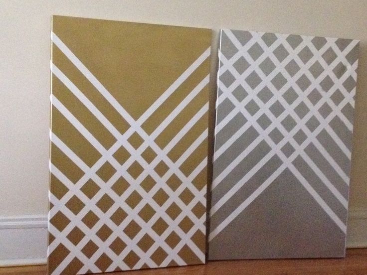
This is what our pages looked like, a series of color studies.
I have to say that this one class has stayed with me and was probably one of the most beneficial curriculums I ever took! I use what I learned every day in my life, my career - as a designer, decorator, working creating patterns in Adobe Creative Suite, styling rooms, setting up spaces whether a trade show booth, a showroom, a client's home or my own. I even use the basis of this knowledge when choosing my outfits and accessories!
Color pairing is so important
How you put things together needs to have a flow, a purpose. Whether it be the outfit you choose to wear, or the color you paint your walls. The relationship of the colors you choose matters! Think about this as you paint your home, so that rooms have a flow from one to the other, and do not clash or look harsh together. Choose a palette that looks good side by side, and look at this collection of colors at all times of the day to see how the light that enters your home bounces and reflects to change these colors.
As you choose furnishings for your home, or add that beautiful scarf to your outfit, think about the palette.
I have to say that this one class has stayed with me and was probably one of the most beneficial curriculums I ever took! I use what I learned every day in my life, my career - as a designer, decorator, working creating patterns in Adobe Creative Suite, styling rooms, setting up spaces whether a trade show booth, a showroom, a client's home or my own.
Color pairing is so important
How you put things together needs to have a flow, a purpose. Whether it be the outfit you choose to wear, or the color you paint your walls. The relationship of the colors you choose matters! Think about this as you paint your home, so that rooms have a flow from one to the other, and do not clash or look harsh together. Choose a palette that looks good side by side, and look at this collection of colors at all times of the day to see how the light that enters your home bounces and reflects to change these colors. As you choose furnishings for your home, or add that beautiful scarf to your outfit, think about the palette.
The relationship of colors can create a mood, a feeling, send a message.... what do you want your message to be.

Monday, June 13, 2016

Design Imitates Nature

Every day we are surrounded with beautiful colors! Nature supplies us with so much eye candy, inspiration for design! This is my favorite time of year..... with the exception of the "yellow pixie dust" most hated and best known as pollen.
PANTONE would probably tell you this is 106C from the coated collection
BENJAMIN MOORE calls it banana yellow 2022-40 from their color preview selection book
But, allergic or not, there's no denying that the yellow color of common pollen is a great target for designs..
We all know this radiant color, it comes in a variety of shades! That being said, yellow does pop a palette like no other!
The combination of YELLOW + GREY have become a staple in design
whether we are talking about interior design, pattern design, in the kitchen, bathroom or bedroom, combinations we see women wear on the street, popping a classic grey outfit with a bright yellow scarf or just the socks you wear on your feet.
The trend of yellows and greys are here to stay for a while... enjoy it, play with it in your space!
Brighten your day!